
The human brain is wired to see structure, logic, and patterns. It helps us make sense of the world. In the 1920s, a group of German psychologists developed theories around how people perceive the world around them, called Gestalt principles.
For example, what do you see when you look at this image?

Source: The Inspired Eye
If you’re like most people, you probably see a triangle. But in reality, all that's there are three white “pac men.” We see the triangle because our brains take the ambiguous visual information and organize it into something that makes sense to us—something familiar, orderly, symmetrical, and that we understand.
When this cognitive process kicks in, our minds leap from comprehending all of the elements as individual and unrelated components to seeing the entire shape as a whole. And as a result, we perceive forms and objects where none were created.
To further illustrate this process, check out the GIF below. Your brain sees a dog walking, but it’s nothing more than a series of moving dots.
 Source: Gizmodo
These are simple examples, but they demonstrate the types of shortcuts our brains make all the time to quickly make sense of the world.
What are the Gestalt principles?
These shortcuts are known as the Gestalt principles of visual perception, and they detail how our brains create structure by default. But why is understanding this important for web and mobile design?
Why designers should care about the Gestalt principles
Great designers understand the powerful role that psychology plays in visual perception. What happens when someone’s eye meets your design creations? How does their mind react to the message your piece is sharing? —Laura Busche, Brand Content Strategist at Autodesk
Think about that quote for a minute. When people first see your designs, how do they experience them? To understand what makes UI design work, you need to understand the psychology of human perception.
The fundamental law that governs a Gestalt principle is that we tend to order our experience in a manner that’s regular, orderly, and recognizable. This is what allows us to create meaning in a complex and chaotic world. And having a solid understanding of how these principles work will help you in three ways.
- They’ll help you determine which design elements are most effective in a given situation. For example, when to use visual hierarchy, background shading, gradients, and how to group similar items and distinguish different ones.
- These psychological principles hold power to influence our visual perception, which allows designers to direct our attention to specific points of focus, get us to take specific actions, and create behavioral change.
- And finally, at the highest level, the Gestalt principles help you design products that solve the customer’s problem or meet the user’s need in a way that’s beautiful, pleasing, and intuitive to use.
Gestalt principles and examples
In this article, we’ll discuss seven Gestalt laws or principles that directly apply to modern design, and share some examples of how they’re used in UI design. This isn’t an exhaustive list, but you’ll quickly begin to notice that there’s an overlap between many of the principles and that they all work together fluidly. Now let’s dive in.
Principle #1: figure-ground
The figure-ground principle states that people instinctively perceive objects as either being in the foreground or the background. They either stand out prominently in the front (the figure) or recede into the back (the ground).

Source: A Dwarf Named Warren
In the image above, for example, your eye instantly sees a white apple sitting on a black background.
This determination will occur quickly and subconsciously in most cases. Figure/Ground lets us know what we should be focusing on and what we can safely ignore in a composition. —Steven Bradley, web designer
When people use your website or mobile app, one of the first things they do on each screen is to determine which is the figure and which is the ground.
Examples of the figure-ground principle
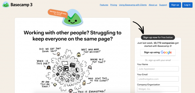
The Basecamp homepage has a bunch of graphics, text, forms, and other information. And because of the figure-ground principle, you can immediately tell that you should focus on the content in the white foreground areas.
AngelList uses the figure-ground principle in two ways below. First, the text and logo on the left side of the page are clearly sitting on top of the background image. Second, the white text in the menu on the right stands on top of the black background.

Principle #2: similarity
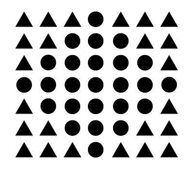
The principle of similarity states that when things appear to be similar to each other, we group them together. And we also tend to think they have the same function.
For instance, in this image, there appear to be two separate and distinct groups based on shape: the circles and the squares.
 Source: Creative Beacon
A variety of design elements, like color and organization, can be used to establish similar groups. In the image below, for example, even though all of the shapes are the same, it’s clear that each column represents a distinct group:
 Source: Andy Rutledge
Examples of the similarity principle
GitHub uses the similarity principle in two ways on the page below. First, they use it to distinguish different sections. You can immediately tell that the grey section at the top serves a different purpose than the black section, which is also separate from and different than the blue section.
Second, they also use the color blue to distinguish links from regular text and to communicate that all blue text shares a common function.

Principle #3: proximity
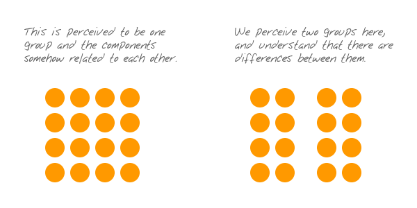
The principle of proximity states that things that are close together appear to be more related than things that are spaced farther apart.
 Source: Andy Rutledge
Proximity is so powerful that it overrides similarity of color, shape, and other factors that might differentiate a group of objects.
 Source: Steven Bradley
Notice the three groups of black and red dots above? The relative nearness of the objects has an even stronger influence on grouping than color does.
Examples of the proximity principle
The nearness of each image and its corresponding text communicates that they’re related to one another.
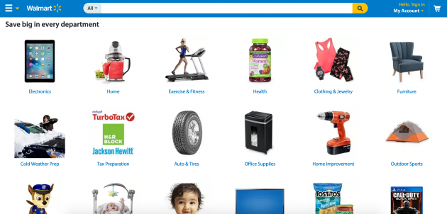
And Vice uses this principle to distinguish between the images, headlines, descriptions, and other information for each of its stories.

Principle #4: common region
The principle of common region is highly related to proximity. It states that when objects are located within the same closed region, we perceive them as being grouped together.
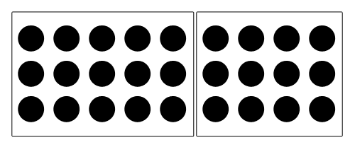 Source: Smashing Magazine
Adding borders or other visible barriers is a great way to create a perceived separation between groups of objects—even if they have the same proximity, shape, size, color, etc.
Examples of the common region principle
In the example from Pinterest below, the common region principle is used to separate each pin—including its photo, title, description, contributor, and other details—from all the other pins around it.

And it’s used in the Facebook example below to communicate that the comments, likes, and interactions are associated with this specific post—and not the other posts surrounding it.

Principle #5: continuity
The principle of continuity states that elements that are arranged on a line or curve are perceived to be more related than elements not on the line or curve.
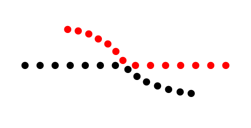 Source: Smashing Magazine
In the image above, for example, the red dots in the curved line seem to be more related to the black dots on the curved line than to the red dots on the straight horizontal line. That’s because your eye naturally follows a line or a curve, making continuation a stronger signal of relatedness than the similarity of color.
Examples of the continuity principle
Amazon uses continuity to communicate that each of the products below is similar and related to each other (books of similar topics that are available for purchase).

Sprig uses it to explain the three-step process to use their app.

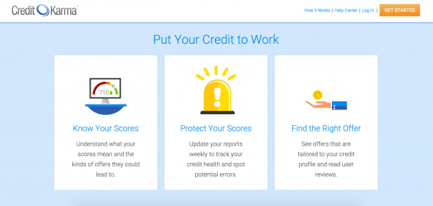
And Credit Karma uses it to illustrate the benefits that their services provide.
Principle #6: closure
The principle of closure states that when we look at a complex arrangement of visual elements, we tend to look for a single, recognizable pattern.
In other words, when you see an image that has missing parts, your brain will fill in the blanks and make a complete image so you can still recognize the pattern.
 Source: Eduard Volianskyi
For example, when you look at the image above, you most likely see a zebra even though the image is just a collection of black shapes. Your mind fills in the missing information to create a recognizable pattern based on your experience.
Examples of the closure principle
The closure principle is used often in logo designs at a variety of companies including IBM, NBC, Zendesk, and Funding Circle.


Principle #7: focal point
The focal point principle states that whatever stands out visually will capture and hold the viewer’s attention first.
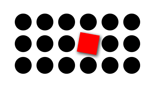 Source: Smashing Magazine
When you look at the image above, for example, the first thing you notice is the red square because it’s different from all of the black circles around it. It’s the first point of interest that grabs your attention, and from there, your attention moves to other parts of the image.
Examples of the focal point principle
Twilio uses the focal point principle to draw your eye to their call-to-action button.

And in the example below, Instacart combines the focal point principle with the figure-ground principle to draw your eye to the white foreground, and then to the green “find stores” button.

How UserTesting can help you test UI design
UI and UX designers alike rely on UserTesting to test prototypes, websites, or apps.
Here’s a glimpse of what you can do:
- UserTesting supports multiple prototyping tools, including Adobe XD Plugin, Figma, Marvel, and more. It’s important to note that technical issues may occur and are even expected, which contributors should be made aware of. Some are excited by getting a first glimpse of a design and their feedback being used to shape the final result. Don’t be afraid to show contributors a rough sketch of early ideas—this ensures you’re on the right path before investing more time, money, and effort. Additionally, consider asking contributors to evaluate specific elements or how well they understand what you’re promoting.
- Whether your website is newly launched or long due for a refresh, UserTesting offers multiple testing options from card sorting, tree tests, to preference tests. Web hosting company GoDaddy leveraged UserTesting to evaluate how users felt after visiting their website. After replicating their original tests for a second round of testing, GoDaddy’s team found increased appeal among customers and further insight on next steps.
- Our customers have tested both existing apps and unreleased iOS app tests. The possibilities are endless, with contributors being able to use the front-facing and back-facing camera to record themselves or their surroundings (depending on the test and its tasks).
Final thoughts
If you understand how the human mind works, it’s easier to direct people’s attention to the right place. And keeping these principles top-of-mind will help you keep the user at the center of your product development process.
Want to learn more?
Explore UX best practices, expert advice, user research templates, and more.
